
[av_section min_height=” min_height_px=’500px’ padding=’huge’ shadow=’no-border-styling’ bottom_border=’no-border-styling’ bottom_border_diagonal_color=’#333333′ bottom_border_diagonal_direction=” bottom_border_style=” custom_arrow_bg=” id=” color=’main_color’ background=’bg_gradient’ custom_bg=’#05d4f9′ background_gradient_color1=’#00c3f9′ background_gradient_color2=’#00e1ff’ background_gradient_direction=’diagonal_bt’ src=” attachment=” attachment_size=” attach=’scroll’ position=’top left’ repeat=’stretch’ video=” video_ratio=’16:9′ overlay_opacity=’0.5′ overlay_color=” overlay_pattern=” overlay_custom_pattern=” av_element_hidden_in_editor=’0′ av_uid=’av-jp46172c’ custom_class=”][/av_section]
[av_section min_height=” min_height_px=’500px’ padding=’default’ shadow=’no-border-styling’ bottom_border=’no-border-styling’ bottom_border_diagonal_color=’#333333′ bottom_border_diagonal_direction=” bottom_border_style=” custom_arrow_bg=” id=’blog-post-content’ color=’main_color’ background=’bg_color’ custom_bg=’#f2f2e8′ background_gradient_color1=” background_gradient_color2=” background_gradient_direction=’vertical’ src=” attachment=” attachment_size=” attach=’scroll’ position=’top left’ repeat=’no-repeat’ video=” video_ratio=’16:9′ overlay_opacity=’0.5′ overlay_color=” overlay_pattern=” overlay_custom_pattern=” av_element_hidden_in_editor=’0′ av_uid=’av-jp461y5j’ custom_class=”]
[av_one_fifth first min_height=’av-equal-height-column’ vertical_alignment=’av-align-middle’ space=” margin=’0px’ margin_sync=’true’ link=” linktarget=” link_hover=” padding=’0px’ padding_sync=’true’ border=” border_color=” radius=’0px’ radius_sync=’true’ background=’bg_color’ background_color=” background_gradient_color1=” background_gradient_color2=” background_gradient_direction=’vertical’ src=” attachment=” attachment_size=” background_position=’top left’ background_repeat=’no-repeat’ animation=” mobile_breaking=” mobile_display=’av-hide-on-mobile’ av_uid=’av-3otvqc’ custom_class=”]
[av_image src=’https://usablemedia.co.uk/wp-content/uploads/2017/09/Paul-180×180.jpg’ attachment=’2398′ attachment_size=’square’ align=” styling=’circle’ hover=” link=” target=” caption=” font_size=” appearance=” overlay_opacity=’0.4′ overlay_color=’#000000′ overlay_text_color=’#ffffff’ copyright=” animation=’pop-up’ av_uid=’av-jp471jdf’ custom_class=” admin_preview_bg=”][/av_image]
[/av_one_fifth][av_four_fifth min_height=” vertical_alignment=” space=” custom_margin=” margin=’0px’ link=” linktarget=” link_hover=” padding=’0px’ border=” border_color=” radius=’0px’ background=’bg_color’ background_color=” background_gradient_color1=” background_gradient_color2=” background_gradient_direction=’vertical’ src=” background_position=’top left’ background_repeat=’no-repeat’ animation=” mobile_breaking=” mobile_display=” av_uid=’av-30z98k’]
[av_heading heading=’Why a mobile friendly website is absolutely essential in 2019′ tag=’h1′ style=’blockquote modern-quote’ size=’32’ subheading_active=’subheading_below’ subheading_size=’20’ margin=” margin_sync=’true’ padding=’10’ color=” custom_font=” av-medium-font-size-title=’36’ av-small-font-size-title=’32’ av-mini-font-size-title=’30’ av-medium-font-size=’16’ av-small-font-size=’14’ av-mini-font-size=’12’ av_uid=’av-jptqgdwf’ custom_class=” admin_preview_bg=”]
Paul Stratford, Creative Director
[/av_heading]
[/av_four_fifth][av_hr class=’invisible’ height=’30’ shadow=’no-shadow’ position=’center’ custom_border=’av-border-thin’ custom_width=’50px’ custom_border_color=” custom_margin_top=’30px’ custom_margin_bottom=’30px’ icon_select=’yes’ custom_icon_color=” icon=’ue808′ font=’entypo-fontello’ av-medium-hide=’aviaTBav-medium-hide’ av-small-hide=’aviaTBav-small-hide’ av-mini-hide=’aviaTBav-mini-hide’ av_uid=’av-jp47b3qm’ custom_class=” admin_preview_bg=”]
[av_textblock size=” font_color=” color=” av-medium-font-size=” av-small-font-size=” av-mini-font-size=” av_uid=’av-jp4741o5′ custom_class=” admin_preview_bg=”]
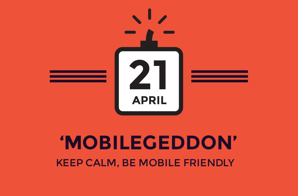
Labelled ‘Mobilegeddon‘ by Entrepreneur magazine and SEO industry insiders – the big change to Google’s algorithm back in April 2017 caught many companies by surprise. As with Google’s other updates – Penguin, Panda & Hummingbird, it negatively affected many businesses that weren’t mobile-friendly and relied on organic search for their business.
Being penalised by Google can be an expensive exercise. Depending on the extent of the penalty from Google, we’ve heard of businesses forking out 10’s of £000’s + and in some cases they simply never recovered…
Don’t get swept up in the nets!
Google is often seen as behaving God-like, deciding on the fate of businesses with swingeing changes to its algorithm. In reality, they probably make these changes to protect us all from spammy Viagra-led hacks and online crooks. So, Googles intention of serving up quality, relevant links to us all is in everyone’s interest. The sad part is that it needs to be automated and programmatic because of the scale of the task and that’s where some innocent fish will get swept up in the nets.
According to research by BIAKelsey Mobile search queries surpassed desktop queries back in 2015. This behavioural trend is set to continue with the addition of new mobile devices such as tablets and watches until mobile dominates search.
[/av_textblock]
[av_four_fifth first min_height=” vertical_alignment=” space=” custom_margin=” margin=’0px’ link=” linktarget=” link_hover=” padding=’0px’ border=” border_color=” radius=’0px’ background=’bg_color’ background_color=” background_gradient_color1=” background_gradient_color2=” background_gradient_direction=’vertical’ src=” background_position=’top left’ background_repeat=’no-repeat’ animation=” mobile_breaking=” mobile_display=” av_uid=’av-e8m2t0′]
[av_image src=’https://usablemedia.co.uk/wp-content/uploads/2018/12/Mobile-friendly.jpg’ attachment=’3946′ attachment_size=’full’ align=’center’ styling=” hover=” link=” target=” caption=” font_size=’16’ appearance=’on-hover’ overlay_opacity=’0.7′ overlay_color=’#000000′ overlay_text_color=’#ff0000′ copyright=” animation=’no-animation’ av_uid=’av-jpo5wfzz’ custom_class=” admin_preview_bg=”]
Netflix Original Logo Design
[/av_image]
[/av_four_fifth][av_hr class=’invisible’ height=’45’ shadow=’no-shadow’ position=’center’ custom_border=’av-border-thin’ custom_width=’50px’ custom_border_color=” custom_margin_top=’30px’ custom_margin_bottom=’30px’ icon_select=’yes’ custom_icon_color=” icon=’ue808′ font=’entypo-fontello’ av_uid=’av-jpo5ln5c’ custom_class=” admin_preview_bg=”]
[av_textblock size=” font_color=” color=” av-medium-font-size=” av-small-font-size=” av-mini-font-size=” av_uid=’av-jp4741o5′ custom_class=” admin_preview_bg=”]
What is ‘mobile-friendly-enough’ and who’s affected?
Being Mobile friendly is a little ambiguous. If a site has a mobile-specific website then you ought to feel secure. If budgets are limited, then this is unlikely. For many SME’s, they ought to have stylesheets (CSS) that change the aesthetic view of their sites according to the devices visitors use. These sites adapt to suit the device the visitors are on (Smartphone, tablet, watch, Desktop, TV etc) and are known as ‘responsive‘ or ‘adaptive‘ websites.
How do you know?
Check how your site looks on a mobile phone. Our rule of thumb is that if you have to ‘pinch and zoom’ then you need to act. If you’re still not sure, fill in the form below and we’ll analyse your site for you with a report stating whether you’re compliant and what you can most easily do if not.
Be certain, act now.
Fill in our form below and we’ll test your site for compliance today – so you can be certain of what will happen in 2019. We’ll also provide some easy tips for what you can do in the next 24 hours to be safe.
[/av_textblock]
[av_heading tag=’h2′ padding=’10’ heading=’Related Services’ color=” style=’blockquote modern-quote modern-centered’ custom_font=” size=’34’ subheading_active=” subheading_size=’15’ custom_class=” admin_preview_bg=” av-desktop-hide=” av-medium-hide=” av-small-hide=” av-mini-hide=” av-medium-font-size-title=” av-small-font-size-title=” av-mini-font-size-title=” av-medium-font-size=” av-small-font-size=” av-mini-font-size=” margin=”][/av_heading]
[av_hr class=’invisible’ height=’30’ shadow=’no-shadow’ position=’center’ custom_border=’av-border-thin’ custom_width=’50px’ custom_border_color=” custom_margin_top=’30px’ custom_margin_bottom=’30px’ icon_select=’yes’ custom_icon_color=” icon=’ue808′ font=’entypo-fontello’ av_uid=’av-jp47b3qm’ custom_class=” admin_preview_bg=”]
[av_partner columns=’6′ heading=” size=’no scaling’ img_size_behave=’no_stretch’ border=’av-border-deactivate’ type=’grid’ animation=’slide’ navigation=’arrows’ autoplay=’false’ interval=’5′ av_uid=’av-jp86aliu’ custom_class=”]
[av_partner_logo id=’3444′ hover=’Digital Assessments’ link=’page,3488′ linktitle=” link_target=” av_uid=’av-bsi4xz’]
[av_partner_logo id=’3446′ hover=’Branding & Design’ link=’page,3488′ linktitle=” link_target=” av_uid=’av-abi4o7′]
[av_partner_logo id=’3448′ hover=’Website Design & Build’ link=’page,3488′ linktitle=” link_target=” av_uid=’av-9ojnl3′]
[av_partner_logo id=’3447′ hover=’Demand Generation’ link=’page,3488′ linktitle=” link_target=” av_uid=’av-qqv47′]
[av_partner_logo id=’3539′ hover=’Hubspot’ link=’page,3488′ linktitle=” link_target=” av_uid=’av-6gkudj’]
[av_partner_logo id=’3537′ hover=’WordPress Security’ link=’page,3488′ linktitle=” link_target=” av_uid=’av-4bxxdz’]
[/av_partner]
[av_button label=’View all latest Services’ link=’page,14′ link_target=” size=’large’ position=’center’ label_display=” icon_select=’yes-right-icon’ icon=’ue875′ font=’entypo-fontello’ color=’custom’ custom_bg=’#000000′ custom_font=’#ffffff’ av_uid=’av-jp47a4p4′ custom_class=” admin_preview_bg=”]
[/av_section][av_section min_height=” min_height_px=’500px’ padding=’large’ shadow=’no-border-styling’ bottom_border=’no-border-styling’ bottom_border_diagonal_color=’#333333′ bottom_border_diagonal_direction=” bottom_border_style=” custom_arrow_bg=” id=” color=’main_color’ background=’bg_color’ custom_bg=’#f2f2e8′ background_gradient_color1=” background_gradient_color2=” background_gradient_direction=’vertical’ src=” attachment=” attachment_size=” attach=’scroll’ position=’top left’ repeat=’no-repeat’ video=” video_ratio=’16:9′ overlay_opacity=’0.5′ overlay_color=” overlay_pattern=” overlay_custom_pattern=” av_element_hidden_in_editor=’0′ av_uid=’av-jp47h7cp’ custom_class=”]
[av_textblock size=’24’ font_color=” color=” av-medium-font-size=” av-small-font-size=” av-mini-font-size=” av_uid=’av-jp47eceo’ custom_class=” admin_preview_bg=”]
“We’re experts in joining the dots between marketing, sales and the very best industry tools and methodologies to deliver ongoing marketing automation with consistent results.”
[/av_textblock]
[av_hr class=’invisible’ height=’30’ shadow=’no-shadow’ position=’center’ custom_border=’av-border-thin’ custom_width=’50px’ custom_border_color=” custom_margin_top=’30px’ custom_margin_bottom=’30px’ icon_select=’yes’ custom_icon_color=” icon=’ue808′ font=’entypo-fontello’ av_uid=’av-jp47b3qm’ custom_class=” admin_preview_bg=”]
[av_heading tag=’h2′ padding=’10’ heading=’Audit. Optimise. Automate. Grow.’ color=’custom-color-heading’ style=’blockquote modern-quote modern-centered’ custom_font=’#000000′ size=’40’ subheading_active=’subheading_below’ subheading_size=’20’ custom_class=’medium-header-blue-span’ admin_preview_bg=” av-desktop-hide=” av-medium-hide=” av-small-hide=” av-mini-hide=” av-medium-font-size-title=” av-small-font-size-title=” av-mini-font-size-title=” av-medium-font-size=” av-small-font-size=” av-mini-font-size=” margin=” av_uid=’av-28ib38′]
Schedule a discussion with Usable media
[/av_heading]
[av_hr class=’invisible’ height=’120′ shadow=’no-shadow’ position=’center’ custom_border=’av-border-thin’ custom_width=’50px’ custom_border_color=” custom_margin_top=’30px’ custom_margin_bottom=’30px’ icon_select=’yes’ custom_icon_color=” icon=’ue808′ font=’entypo-fontello’ av_uid=’av-jp47b3qm’ custom_class=” admin_preview_bg=”]
[/av_section]
[av_section min_height=’custom’ min_height_px=’400px’ padding=’large’ shadow=’no-border-styling’ bottom_border=’no-border-styling’ bottom_border_diagonal_color=’#333333′ bottom_border_diagonal_direction=” bottom_border_style=” id=” color=’main_color’ custom_bg=’#000000′ src=” attachment=” attachment_size=” attach=’scroll’ position=’bottom center’ repeat=’stretch’ video=” video_ratio=’16:9′ overlay_opacity=’0.5′ overlay_color=” overlay_pattern=” overlay_custom_pattern=” av_element_hidden_in_editor=’0′ av_uid=’av-18l67lg’]
[av_one_full first min_height=” vertical_alignment=’av-align-top’ space=” custom_margin=’aviaTBcustom_margin’ margin=’-200px,0px’ link=” linktarget=” link_hover=” padding=’0px’ padding_sync=’true’ border=” border_color=” radius=’0px’ radius_sync=’true’ background=’bg_color’ background_color=” background_gradient_color1=” background_gradient_color2=” background_gradient_direction=’vertical’ src=” attachment=” attachment_size=” background_position=’top left’ background_repeat=’no-repeat’ animation=’pop-up’ mobile_breaking=” mobile_display=” av_uid=’av-jpmgxdy5′ custom_class=’hubspot-meeting’]
[av_codeblock wrapper_element=” wrapper_element_attributes=” codeblock_type=” av_uid=’av-jpmgx71l’ custom_class=”]
[/av_codeblock]
[/av_one_full][av_one_fourth first min_height=” vertical_alignment=” space=” custom_margin=” margin=’0px’ padding=’0px’ border=” border_color=” radius=’0px’ background_color=” src=” background_position=’top left’ background_repeat=’no-repeat’ animation=” av_uid=’av-130o278′]
[av_image src=’https://usablemedia.co.uk/wp-content/uploads/2016/03/Usablemedia-logo-sm-white.png’ attachment=’1910′ attachment_size=’full’ align=’left’ styling=” hover=” link=” target=” caption=” font_size=” appearance=” overlay_opacity=’0.4′ overlay_color=’#000000′ overlay_text_color=’#ffffff’ animation=’no-animation’ admin_preview_bg=” av_uid=’av-11u6kh0′][/av_image]
[/av_one_fourth][av_one_fourth min_height=” vertical_alignment=” space=” custom_margin=” margin=’0px’ padding=’0px’ border=” border_color=” radius=’0px’ background_color=” src=” background_position=’top left’ background_repeat=’no-repeat’ animation=” av_uid=’av-lo57hg’]
[av_textblock size=’18’ font_color=’custom’ color=’#ffffff’ av-medium-font-size=” av-small-font-size=” av-mini-font-size=” av_uid=’av-kzgd10′ custom_class=” admin_preview_bg=”]
Industries
Software, Technology & Startups
[/av_textblock]
[/av_one_fourth][av_one_fourth min_height=” vertical_alignment=” space=” custom_margin=” margin=’0px’ padding=’0px’ border=” border_color=” radius=’0px’ background_color=” src=” background_position=’top left’ background_repeat=’no-repeat’ animation=” av_uid=’av-jcl0qc’]
[av_textblock size=’18’ font_color=’custom’ color=’#ffffff’ av-medium-font-size=” av-small-font-size=” av-mini-font-size=” av_uid=’av-hz31hw’ custom_class=” admin_preview_bg=”]
Services
[/av_textblock]
[/av_one_fourth][av_one_fourth min_height=” vertical_alignment=” space=” custom_margin=” margin=’0px’ padding=’0px’ border=” border_color=” radius=’0px’ background_color=” src=” background_position=’top left’ background_repeat=’no-repeat’ animation=” av_uid=’av-g9qblw’]
[av_textblock size=’18’ font_color=’custom’ color=’#ffffff’ av-medium-font-size=” av-small-font-size=” av-mini-font-size=” av_uid=’av-et415w’ custom_class=” admin_preview_bg=”]
Contact
[/av_textblock]
[av_textblock size=’18’ font_color=’custom’ color=’#ffffff’ av-medium-font-size=” av-small-font-size=” av-mini-font-size=” admin_preview_bg=” av_uid=’av-yhmah0′]
International House
1, St Katharine’s Way
E1W 1UN
London
[/av_textblock]
[av_font_icon icon=’ue8f1′ font=’entypo-fontello’ style=” caption=” link=’manually,https://twitter.com/Insightultweets’ linktarget=” size=’40px’ position=’left’ color=’#515151′ admin_preview_bg=” av_uid=’av-v0fh3o’][/av_font_icon]
[av_image src=’https://usablemedia.co.uk/wp-content/uploads/2017/03/Clear.png’ attachment=’2788′ attachment_size=’full’ align=’left’ styling=” hover=” link=” target=” caption=” font_size=” appearance=” overlay_opacity=’0.4′ overlay_color=’#000000′ overlay_text_color=’#ffffff’ animation=’no-animation’ admin_preview_bg=” av_uid=’av-2k6tz8′][/av_image]
[av_font_icon icon=’ue8f5′ font=’entypo-fontello’ style=” caption=” link=’manually,https://www.facebook.com/usablemedia/’ linktarget=” size=’40px’ position=’left’ color=’#515151′ admin_preview_bg=” av_uid=’av-2o6ng4′][/av_font_icon]
[av_image src=’https://usablemedia.co.uk/wp-content/uploads/2017/03/Clear.png’ attachment=’2788′ attachment_size=’full’ align=’left’ styling=” hover=” link=” target=” caption=” font_size=” appearance=” overlay_opacity=’0.4′ overlay_color=’#000000′ overlay_text_color=’#ffffff’ animation=’no-animation’ admin_preview_bg=” av_uid=’av-2k6tz8′][/av_image]
[av_font_icon icon=’ue8fc’ font=’entypo-fontello’ style=” caption=” link=’manually,https://uk.linkedin.com/company/usable-media-limited’ linktarget=” size=’40px’ position=’left’ color=’#515151′ admin_preview_bg=” av_uid=’av-og2684′][/av_font_icon]
[/av_one_fourth]
[/av_section]
[av_section min_height=’custom’ min_height_px=’450px’ padding=’large’ shadow=’no-border-styling’ bottom_border=’no-border-styling’ bottom_border_diagonal_color=’#333333′ bottom_border_diagonal_direction=” bottom_border_style=” id=” color=’main_color’ custom_bg=’#000000′ src=’https://usablemedia.co.uk/wp-content/uploads/2017/07/Usable-London-city-footer-1.jpg’ attachment=’2649′ attachment_size=’full’ attach=’scroll’ position=’top center’ repeat=’stretch’ video=” video_ratio=’16:9′ overlay_opacity=’0.5′ overlay_color=” overlay_pattern=” overlay_custom_pattern=” av_element_hidden_in_editor=’0′ av_uid=’av-19pqhw’][/av_section]
[av_section min_height=” min_height_px=” padding=’no-padding’ shadow=’no-border-styling’ bottom_border=’no-border-styling’ bottom_border_diagonal_color=’#333333′ bottom_border_diagonal_direction=” bottom_border_style=” id=” color=’main_color’ custom_bg=’#000000′ src=” attachment=” attachment_size=” attach=’scroll’ position=’bottom center’ repeat=’stretch’ video=” video_ratio=’16:9′ overlay_opacity=’0.5′ overlay_color=” overlay_pattern=” overlay_custom_pattern=” av_element_hidden_in_editor=’0′ av_uid=’av-asupac’]
[av_one_full first min_height=” vertical_alignment=” space=” custom_margin=” margin=’0px’ padding=’0px’ border=” border_color=” radius=’0px’ background_color=” src=” background_position=’top left’ background_repeat=’no-repeat’ animation=” av_uid=’av-xqx8k’]
[av_textblock size=’18’ font_color=’custom’ color=’#ffffff’ av-medium-font-size=” av-small-font-size=” av-mini-font-size=” admin_preview_bg=” av_uid=’av-72ab50′]
Home | About us | Services | Results | Contact us
[/av_textblock]
[/av_one_full]
[/av_section]
[av_section min_height=” min_height_px=” padding=’no-padding’ shadow=’no-border-styling’ bottom_border=’no-border-styling’ bottom_border_diagonal_color=’#333333′ bottom_border_diagonal_direction=” bottom_border_style=” id=” color=’main_color’ custom_bg=’#000000′ src=” attachment=” attachment_size=” attach=’scroll’ position=’bottom center’ repeat=’stretch’ video=” video_ratio=’16:9′ overlay_opacity=’0.5′ overlay_color=” overlay_pattern=” overlay_custom_pattern=” av_element_hidden_in_editor=’0′ av_uid=’av-5o26jo’]
[av_one_full first min_height=” vertical_alignment=” space=” custom_margin=” margin=’0px’ padding=’0px’ border=” border_color=” radius=’0px’ background_color=” src=” background_position=’top left’ background_repeat=’no-repeat’ animation=” av_uid=’av-3vjv5g’]
[av_textblock size=’14’ font_color=’custom’ color=’#ffffff’ av-medium-font-size=” av-small-font-size=” av-mini-font-size=” admin_preview_bg=” av_uid=’av-2qf8ok’]
© Copyright Usable Media 2017
[/av_textblock]
[/av_one_full]
[/av_section]